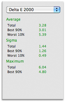
Total: How much does the very worst patch differ under the two illuminants.
Best 90%: When evaluating the worst 10% of the patches how does the best 90% of these perform.
What creates colour inconstancy
The main issues that affect colour inconstancy (apparent change of colors when viewing something under different light sources) is the composition of the inks. Certain inks reflect pretty much the same amount of colour under various light sources, others differ a lot (this is of course grossly simplified). Optical brightener in the paper can also be a source, as optical brightener will take portions of invisible ultraviolet light and re-emit it in the visual spectrum. On certain papers a yellow colour can be measured to reflect 120% of the light (which is a lot better that a perfect reflector like polished silver or what have we). Optical brighteners will affect almost all colours but particular pastels will suffer. When measuring optical brightened paper it usually reads as being blue.
In certain ink-sets, it is the presence of one or two of the inks that will tip's the balance between acceptable and unacceptable. When using certain RIP's (Raster Image Processors) one has the ability to limit inks very accurately. One can also build profiles that will drastically improve colour constancy in certain colours and in particular in neutrals. The optimal combination of inklimiting, RIP and Colour profiles can work wonders.
Optimizing color constancy
At Pixl we've spent a lot of time testing and trying to figure out how to make perfect colour AND perfect Black & White prints on ink-jet printers. We've found a formula which, in our own opinion, is very succesful. Judge for yourself though, both by the numbers and visually. We've included a sample with both an RGB profile and our own "Mono" profile concept, done on the same printer/paper/ink (and no we didn't cheat with the visuals or measurements in the test in any way). Pay particular attention the neutral colours which, in our "mono" profiles are superior to everything else in this test, and almost on par with a Macbeth ColorChecker!
We can and do build such profiles for other "Feinsmechers" who needs the best possible results. It requires a RIP and in many cases the profiles must be done on-site which makes the procedure somewhat more expensive than regular remote profiles. Please enquire Thomas, th@pixl.dk, if you are interested in this.
The techincal stuff
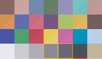
The patches printed are the Macbeth ColourChecker 24 + 4 additional colours from a ColorChecker DC. The colours are derived from measuring the chart (and a few other colours from the DC chart) with a spectrophotometer.
The measured LAB colours were then converted to DON RGB (a very, very large working space). Prints were then converted from DON RGB to the custom printer profiles for each printer, using Relative Colorimetric intent. The patches were then measured spectrally, and compared.
Lightsources used for comparison are standard illuminants, but they represent some the most common light sources used around.
The comparison work (somewhat simplified) like this:
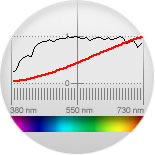
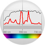
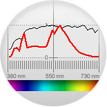
When a certain colour is measured spectrally one knows how much of each wave-lengths (nm) of light wil be reflected. For the measurement filtered tungsten is used, and a mathematic model is applied to adapt the measurements to correspond with D50 daylight. Then, one can compare the reflectance of one light source with another (which has also been measured spectrally). Certain cromatic adaption formulas is applied to simulate the eye's ability to "white balance" under different light. If the cromatic adaption wasn't taken into account a white under tungsten would appear yellow and under Fluorescent light it would appear green. As you can see from the test they don't.
The cromatic adaption, for various reasons, isn't perfect but it's pretty close, and the same formula used on all samples so equal terms for all.
Credits and conclusion
I would like to extend a large thanks to the generous people who have helped with this test by printing samples on their various printers and papers - thanks a lot to all of you!
I've spent the better part of a couple of months trying to figure out exactly what the implications for various imagetypes are, and worked on possible soloutions. I'm happy to say I've discovered that by utilizing a rip (the important part is it's a CMYK printer driver) which will allow the nessesary control over the individual inks, in combination with a certain way of building profiles, color constancy problems can largely be eliminated (to a degree similar to a GretagMacbeth Color Checker. In essence people who need images that will hardly change appearence under various lightsources need look no further.